TravelWise
Exchange App
Your Global Currency Companion
Market Research
The Claim
Over the last 10 years, the global currency exchange industry has grown from $5.1 trillion in 2016 to $9.6 trillion per day in 2025, according to the Bank for International Settlements (BIS).
The Problem
Many travelers struggle to exchange currencies quickly and conveniently, whether they are abroad or shopping online.
Traditional methods are often slow, location dependent, and lack transparency in fees, leaving users frustrated and uncertain about the true cost of their transactions.
Daily global currency exchange volume (BIS)
Competitive Analysis
I analyzed three key players in this space, assessing their strengths, weaknesses, and customer pain points based on app reviews.
Feature heavy financial ecosystem with banking and crypto
Our Advantage: We win users with simplicity and focus on travel specific needs
High trust platform for transfers with a utilitarian interface
Our Advantage: We borrow their trust and transparency, then add traveler functionality and warmth
High trust platform for transfers with a utilitarian interface
Our Advantage: We go beyond with AI insights, wider coverage, and smarter rate alerts
Common Problems
"Rates keep changing, and I usually end up doing it when it's least favorable. I wish I had alerts telling me the best time to convert between currencies."
 A. Mavuso
"Whenever I travel or freelance, my money ends up scattered: PayPal in USD, card in ZAR, savings in EUR. I just want one simple place to see and convert everything."
 P. Naomi
"When I arrive in a new country, I often have no idea where to find an ATM nearby. I end up walking around aimlessly or relying on strangers for directions; it wastes time and feels unsafe."
 S. Peterson
"I wish there was a way to just pay for things using my phone, because often my cards aren't supported in foreign countries. It's stressful carrying extra cash or worrying if my card will work."
 G. Maluleka
Intelligent by Design
Static rates without context or timing guidance
AI powered predictive insights and real time alerts that help travelers make smarter decisions
Laser Focused
Overextended into banking, crypto, and stocks
Built exclusively for travelers and in trip conversions. Nothing more, nothing less
Modern, Human UX
Functional yet cold or cluttered interfaces
Modern, human UX with simplified flows, friendly visuals, and location aware features
Feature and UX Comparison Matrix
| Features / Capabilities | Wise | Revolut | YouTrip | TravelWise |
|---|---|---|---|---|
| Transparent Rates | ✓ | ✓ | ✓ | ✓ |
| Location Based Feature (ATM Finder) | ✕ | ⚠ Limited | ✕ | ✓ |
| Multi Currency Wallet | ✓ | ✓ | ⚠ Limited | ✓ |
| Travel First Focus | ✕ | ⚠ Limited | ✓ | ✓ |
| Personalized Rate Alerts | ✕ | ✕ | ✕ | ✓ |
| NFC Payment | ✕ | ✕ | ✕ | ✓ |
| AI Driven Insights | ✕ | ⚠ Limited | ✕ | ✓ |
| UX Personality | Utility Focused | Banking Centric | Minimalist | Friendly, Contextual |
User Survey
I conducted a quick survey on Reddit under a relevant subreddit of frequent travelers and users who exchange currencies frequently for various reasons.

What do you consider the most important thing or feature in a digital currency exchange app?
Notable Comments
Personas
I created two personas based on two types of exchange app users.


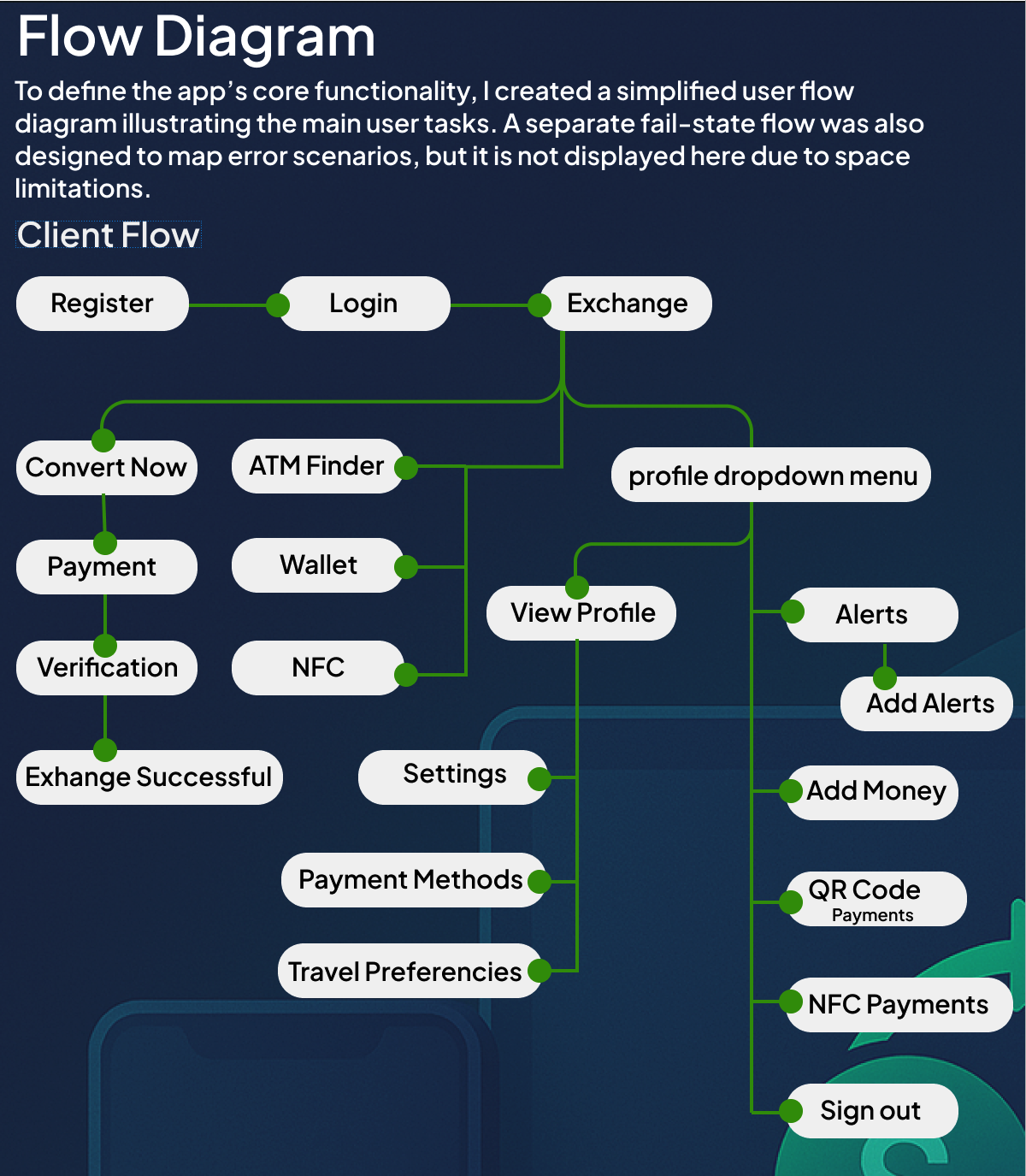
Flow Diagram
To define the app's core functionality, I created a simplified user flow diagram illustrating the main user tasks. A separate fail state flow was also designed to map error scenarios, but it is not displayed here due to space limitations.
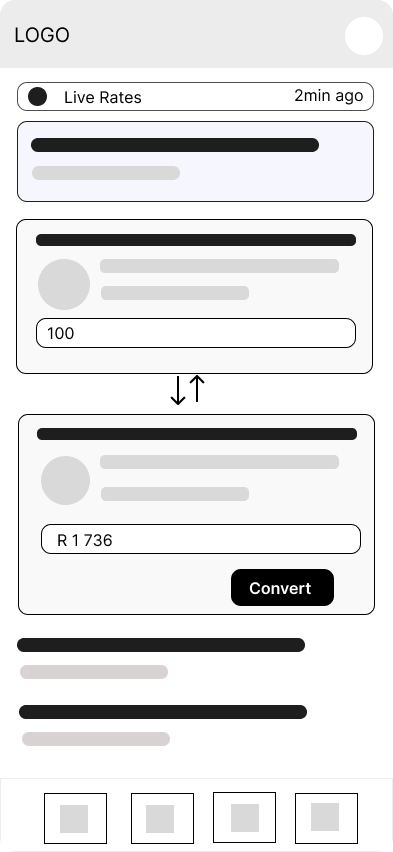
Low Fidelity Wireframes
Once the flow diagram was finalized, I developed the low fidelity wireframes for the primary user flows.
 Home
Home
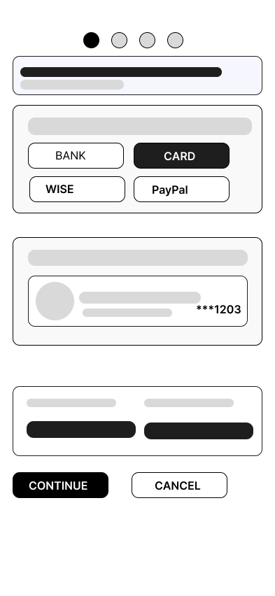
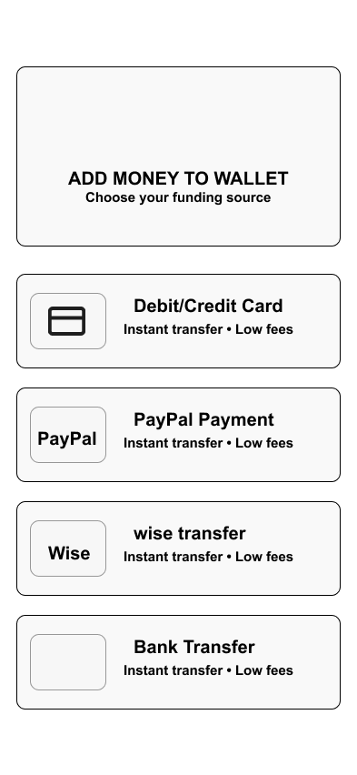 Add Money
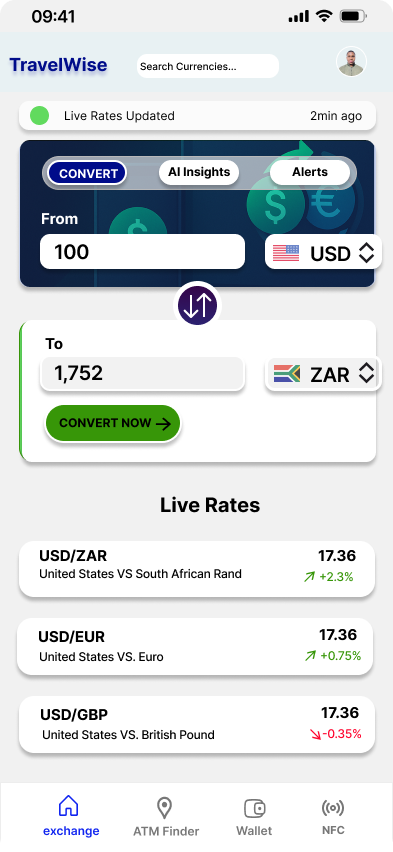
 Quick Exchange
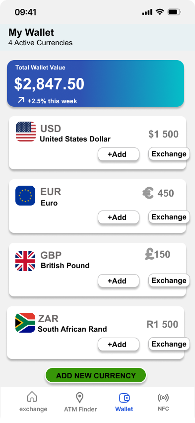
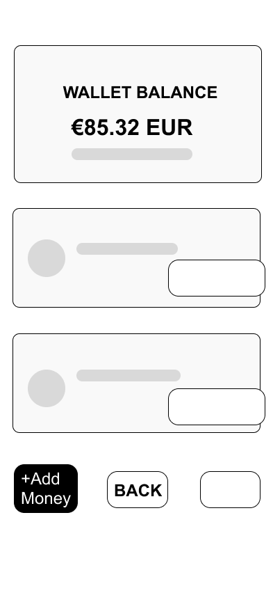 Wallet
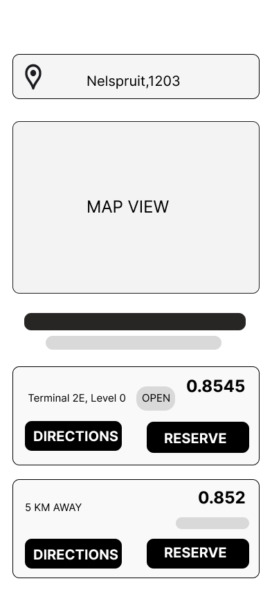 ATM Finder
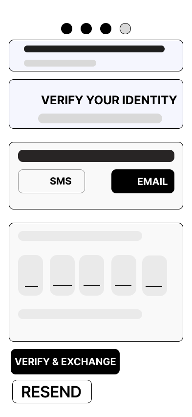 Verification
High Fidelity UI Design
After completing the initial flow, I designed a few of the main screens for the app. I began by defining the fonts and colors to establish the visual style.
Color Palette
26 High Fidelity designs were created. These are some of the designs that were created.
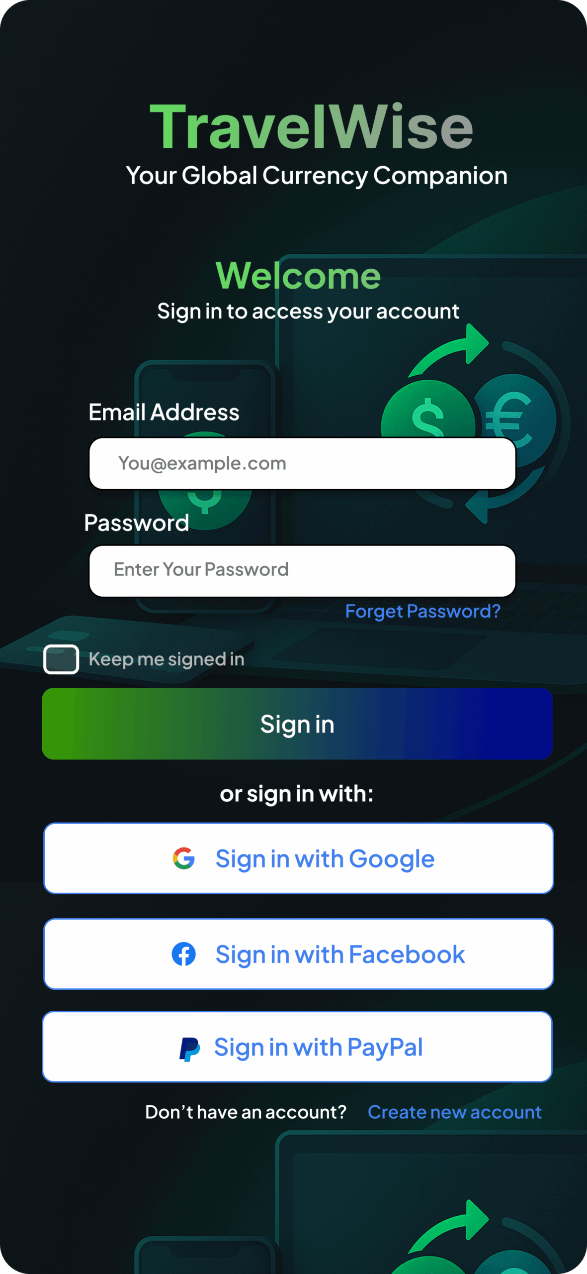 Sign In
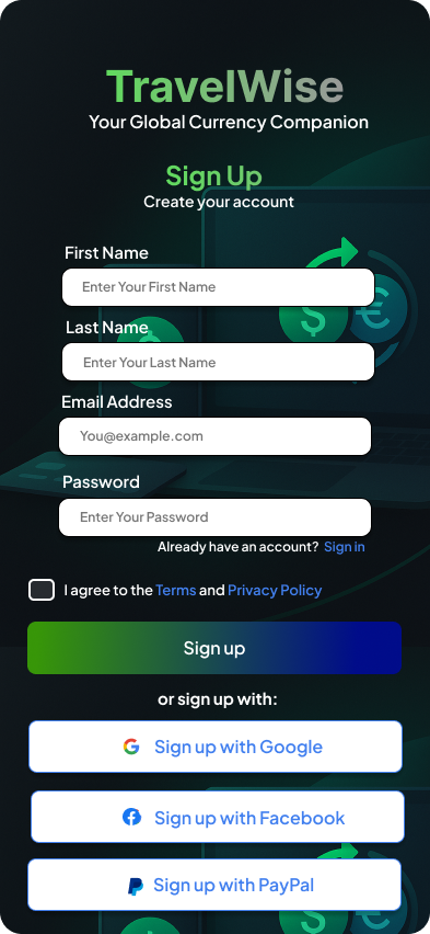
 Sign Up
 Home
Home
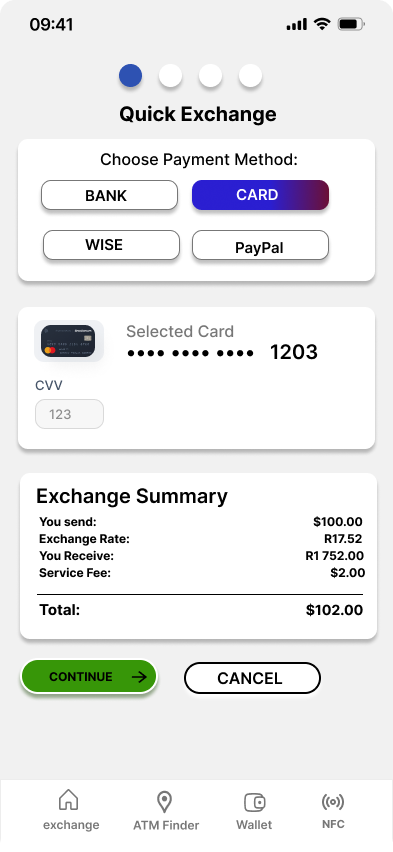 Quick Exchange
Wallet
Quick Exchange
Wallet
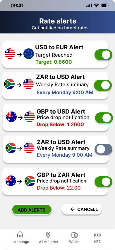 Alerts
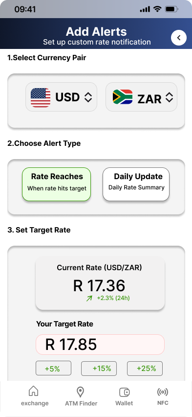 Add Alert
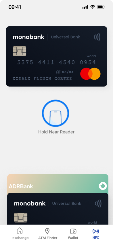 NFC Payment
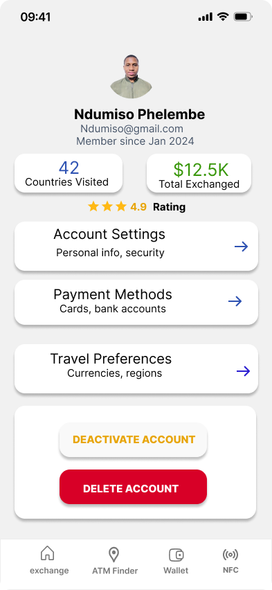 Profile
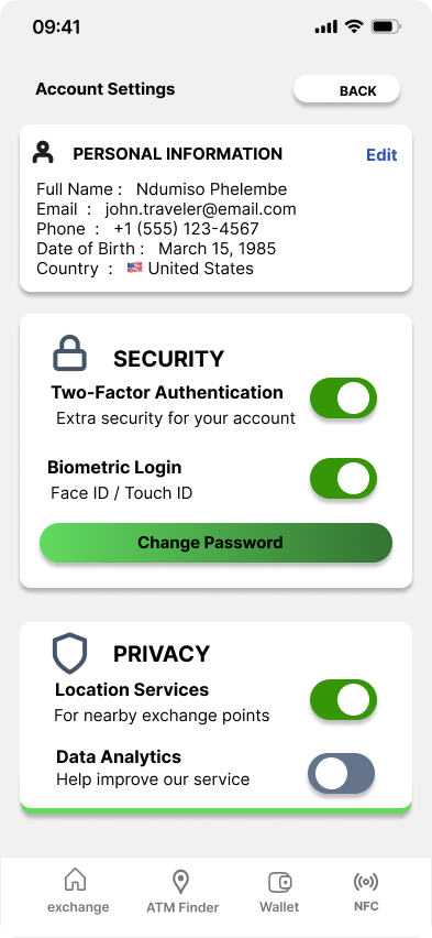 Account Settings
High Fidelity Prototype
I connected my high fidelity designs into a clickable prototype that allows app testing and interaction.
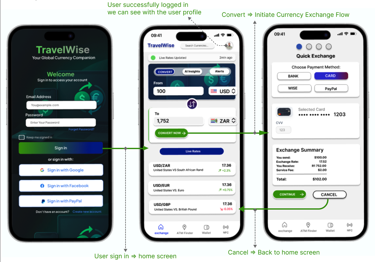
Prototype Validation
To evaluate the usability of the prototype, I conducted an in person usability study with five participants. Each participant was assigned a focused subset of the prototype aimed at testing the core task: exchanging one currency to another within 60 seconds.
Before beginning, users were briefly introduced to the product's purpose and informed of the task goal. The objective was to observe how intuitively and efficiently users could complete the primary action of the app, which was to initiating and completing a currency exchange.
Study Results
Eighty percent (4 out of 5 participants) successfully completed the main task within 60 seconds. One participant (20 percent) required approximately 80 seconds to complete the same task.
A key insight from the test group was the influence of technical familiarity:
- The four participants who completed the task under 60 seconds were generally tech savvy, navigating the flow with ease.
- The participant who exceeded the time threshold was less familiar with mobile financial apps and was 50 years old, which contributed to slower navigation.
Prototype Validation Results
Interpretation
Despite the variance in digital skill levels, the overall results were strongly positive. The fact that 80 percent completed the task well within the target time demonstrates that the core exchange flow is intuitive and efficient.
The single slower completion time is understandable given the user's limited technical experience, and it highlights an opportunity to further support less tech savvy users through clearer visual cues, additional confirmations, or optional guidance within the interface.
Prototype Iteration
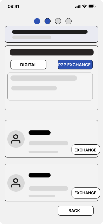
Removed Flow: P2P Pickup Exchange
Based on the usability findings, we decided to remove the P2P pickup exchange flow from the prototype. Older users struggled with the extra steps involved, and the in person cash exchange model introduced safety concerns outside our control.
To keep the experience simple, secure, and consistent with user behavior, the prototype was refined to focus solely on digital exchange, which users completed faster and trusted more during testing.
1. Poor Usability for Older or Less Tech Savvy Users
Study participants over 45 struggled with:
- understanding the peer to peer concept,
- trusting the idea of meeting strangers,
- navigating the extra steps required to complete the flow.
This led to slower completion times and lower confidence ratings.
A P2P cash exchange introduces risk factors the product cannot control:
- meeting in unknown locations,
- potential fraud,
- personal safety concerns,
- legal and compliance limitations across different countries.
This goes against TravelWise's goal of providing safe, predictable, transparent currency exchange experiences.
Accessibility
The app has been evaluated for contrast to match AA standards of WCAG. In some areas I found that the contrast can be improved.
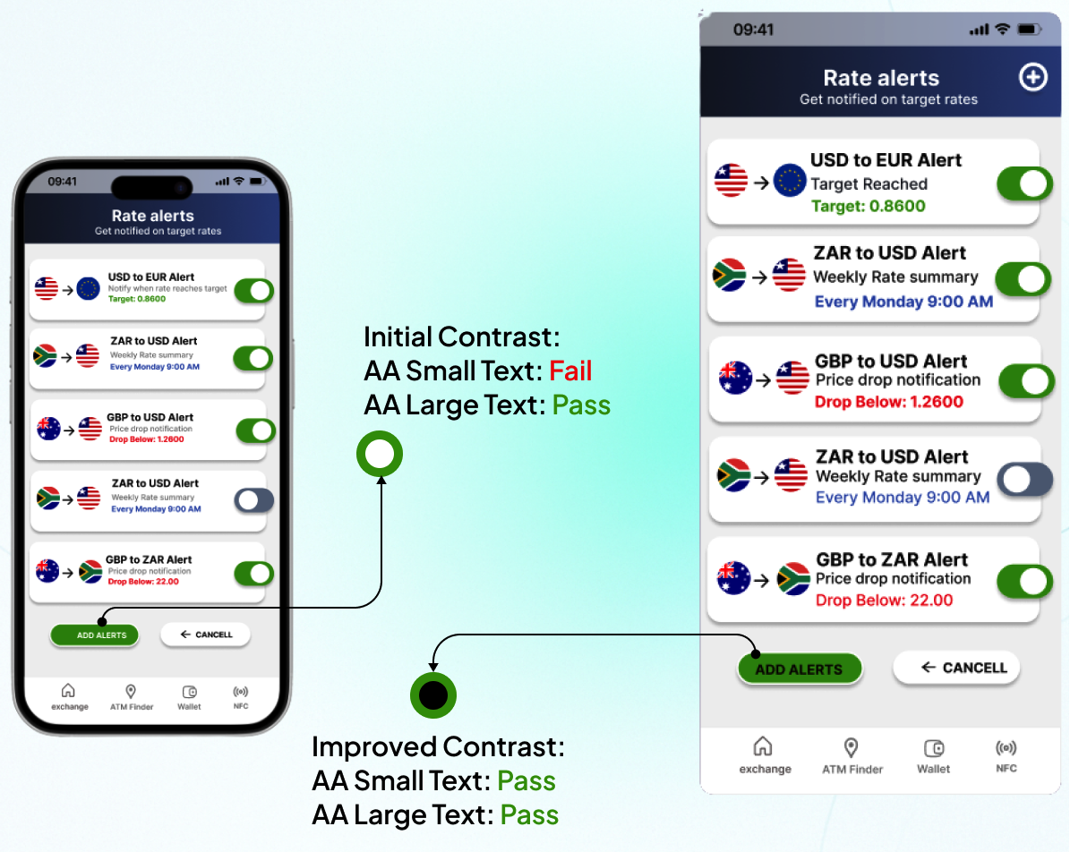
The add alert button shows this well. The first idea aimed to make its call to action stand out, but the chosen color failed accessibility checks. The final version resolves this with an accessible option.
The initial design used a bright mint green (#7fffb0) button on a dark background. While visually striking, this combination produced insufficient contrast for small text, failing WCAG AA standards.
The improved version uses a deep forest green (#1a7a4a) background with white text, achieving a contrast ratio above 7:1, which satisfies both WCAG AA and AAA criteria across all text sizes.
This change ensures the primary call to action remains prominent while being fully accessible to users with visual impairments, including those with low vision or color blindness.
Project Summary
During the project, I evaluated the market by conducting primary research through user surveys on Reddit, as well as secondary research by analyzing exchange platforms and reading user reviews. This helped me understand users' pain points and identify potential solutions.
These initiatives allowed me to empathize deeply with users. Based on the research and survey findings, I was able to clearly define the problem, then move on to ideation and prototyping. After creating the prototype, we conducted user testing and gathered feedback from participants. Using these insights, we made several design iterations to improve the solution.