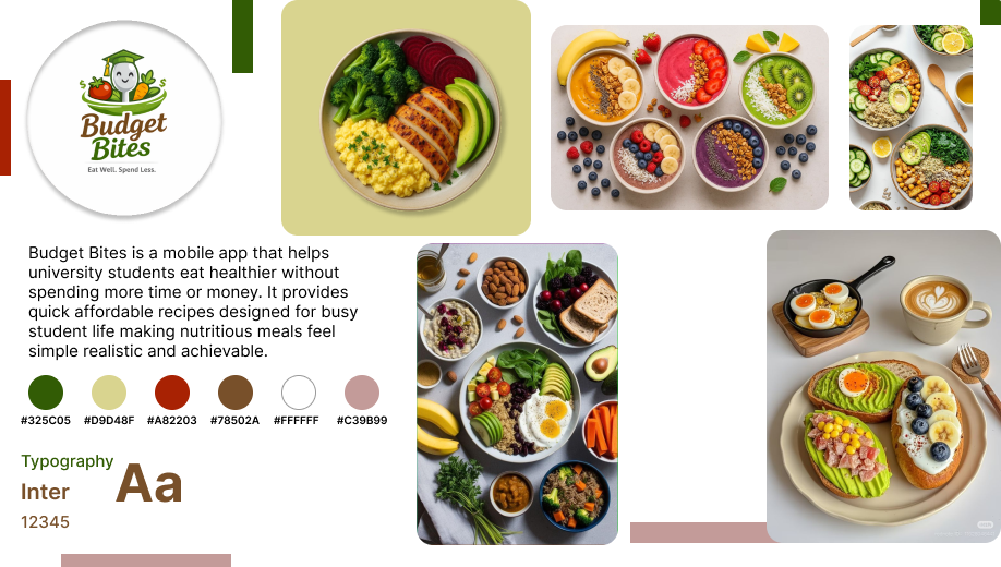
Budget
Bites
A mobile app that helps university students eat well on a tight budget. Quick, healthy, and affordable recipes designed around real student life.
The Student
Food Dilemma
University students face a perfect storm: no time, no budget, and limited cooking skills. Budget Bites was designed to break the instant noodle cycle by making real, healthy cooking accessible and genuinely enjoyable.
How might we help students discover budget meals without feeling overwhelmed by planning?
How might we surface the real cost of a recipe before a student commits to making it?
How might we make healthy eating feel achievable rather than aspirational for students?
The Busy Scholar
Needs meals under 15 minutes. Juggles lectures, assignments, and a social life, and cooking cannot be another chore on the list.
The Budget Conscious
Lives on a tight allowance. Needs cheap, shelf-stable ingredients and clear cost per serving shown upfront before they even start.
The Health Seeker
Wants to avoid processed junk without spending a fortune. Needs accessible nutrition guidance that feels supportive, not preachy.
From Sketch
to System
The process followed the full Design Thinking framework, starting with hand sketches to test structure and hierarchy before a single pixel was placed in Figma.
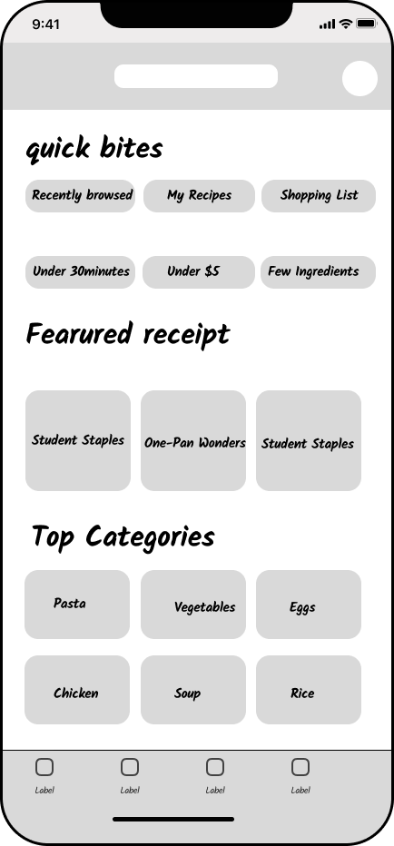
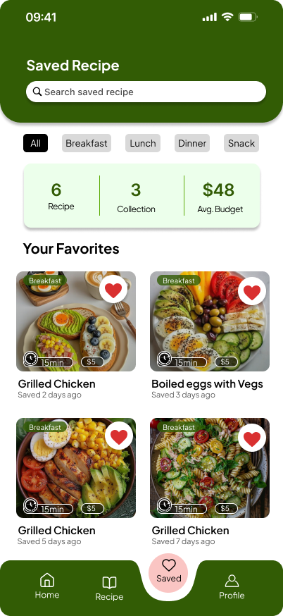
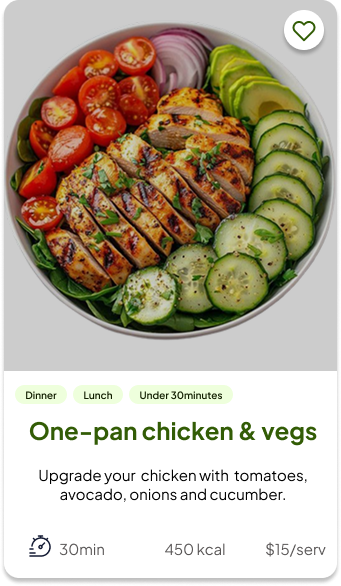
Home Screen
Discover · Featured Recipes · Categories
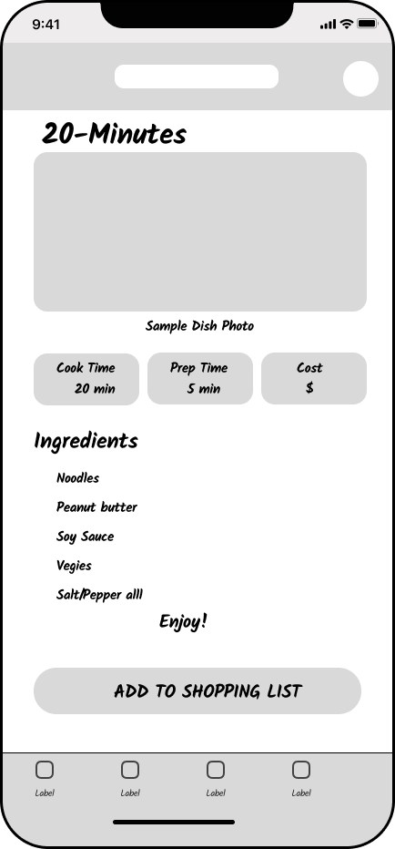
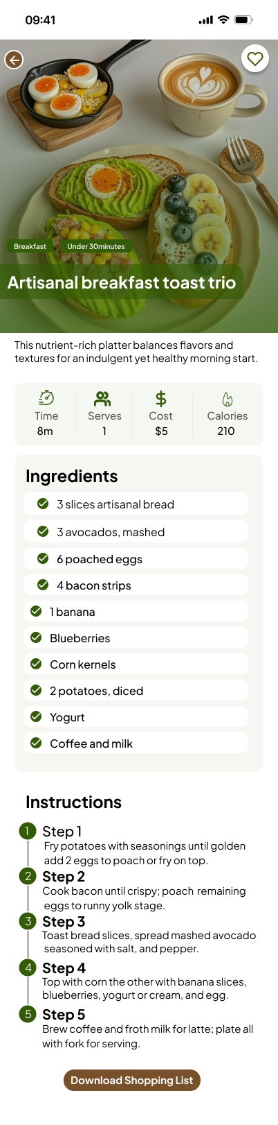
Recipe Detail
Ingredients · Instructions · Cost
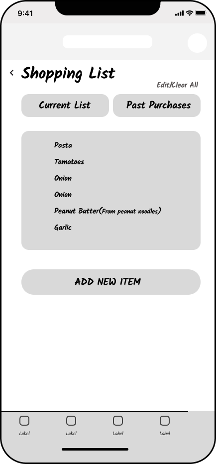
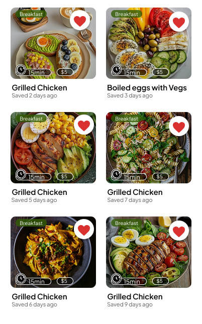
Shopping List
Current List · Past Purchases · Add Items
Empathise and Research
User interviews, empathy mapping, and persona creation grounded every design decision in real student behaviour and lived pain points.
Personas · Empathy MapsDefine and Ideate
How Might We questions reframed the problem into opportunity spaces. Crazy 8 sketches explored layout directions before committing to Figma.
HMW · Crazy 8s · POVPrototype and Test
Component library built with Atomic Design principles. Auto Layout nav bar, filter chips, and recipe cards tested for accessibility and real device fit.
Auto Layout · WCAG AAAEarthy, Warm,
Approachable
The moodboard locked in an Earthy and Organic direction: communal, warm, and abundant. Nothing clinical or sterile. Food is joy, and the visual language had to reflect that fully.
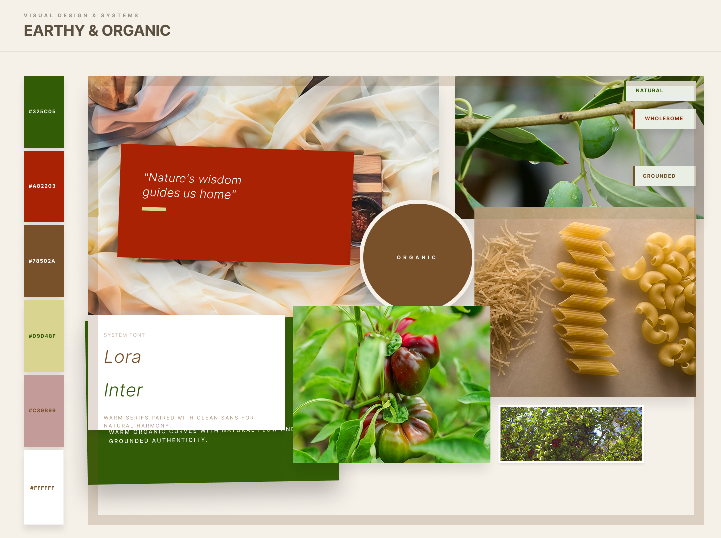
Colour Direction
Deep forest greens rooted in nature, earthy bark tones for warmth, and chili red for urgency and energy, all balanced against a soft parchment background.
Photography Style
Overhead shots with natural light and vibrant produce. Imagery that makes simple, affordable food look genuinely desirable and achievable by any student.
Typography Tone
Playfair Display brings editorial warmth and personality to headings. DM Sans keeps body copy clean and highly readable at small sizes on mobile screens.
Accessibility Commitment
All text colour combinations were validated against WCAG AAA standards, ensuring the app is fully readable for all users regardless of vision ability.
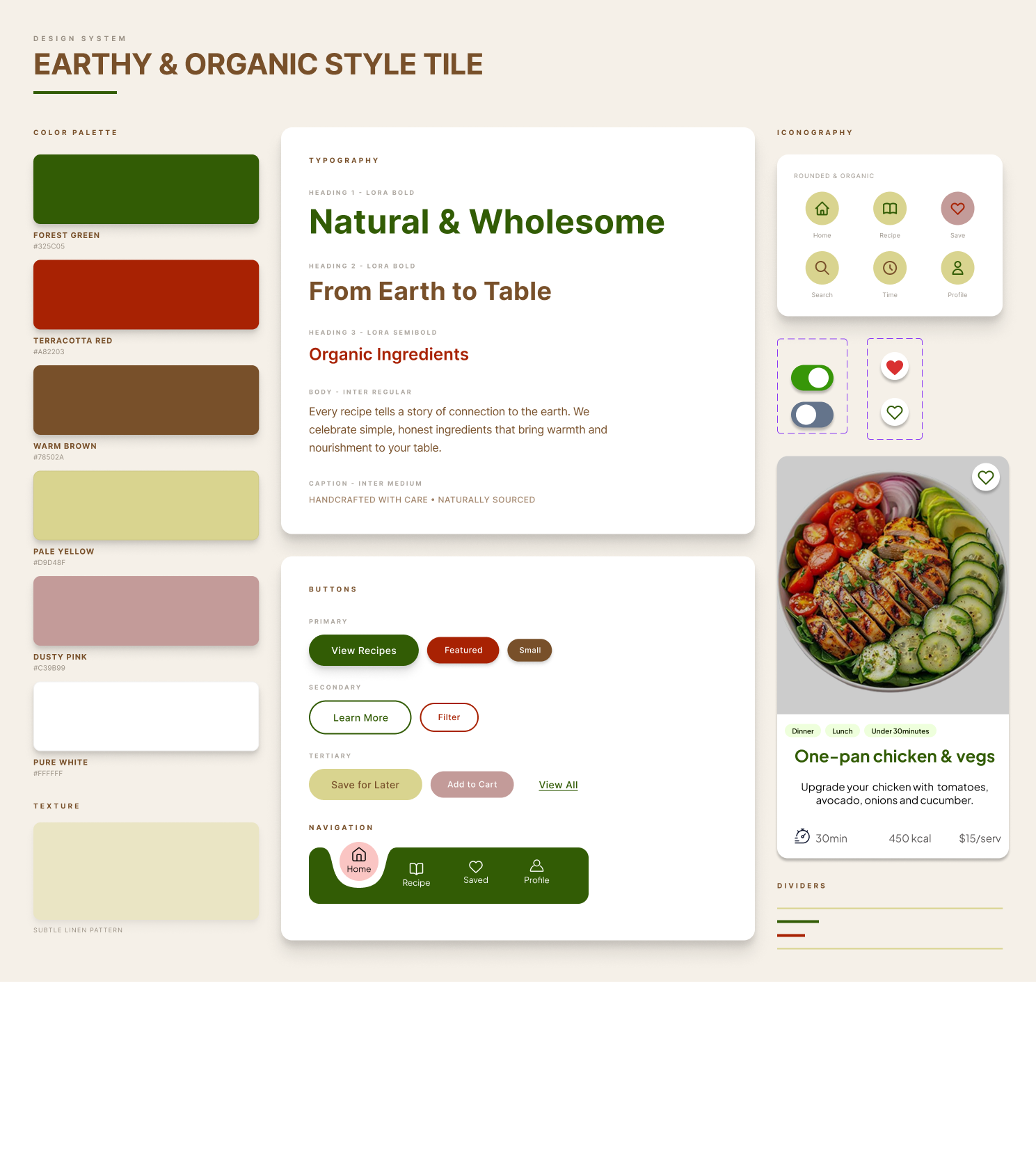
The Style Tile
A single source of truth consolidating logo, colour palette, typography, iconography, and UI states, ensuring visual consistency across every single screen.
Screen Flows
From onboarding through recipe discovery, every screen follows a consistent component library and auto layout grid system throughout.
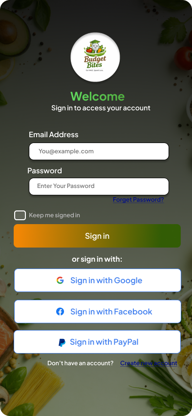
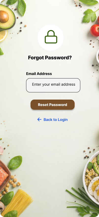
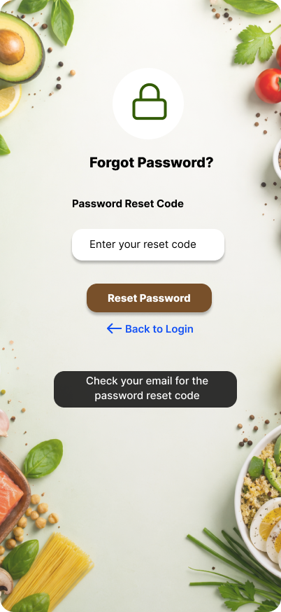
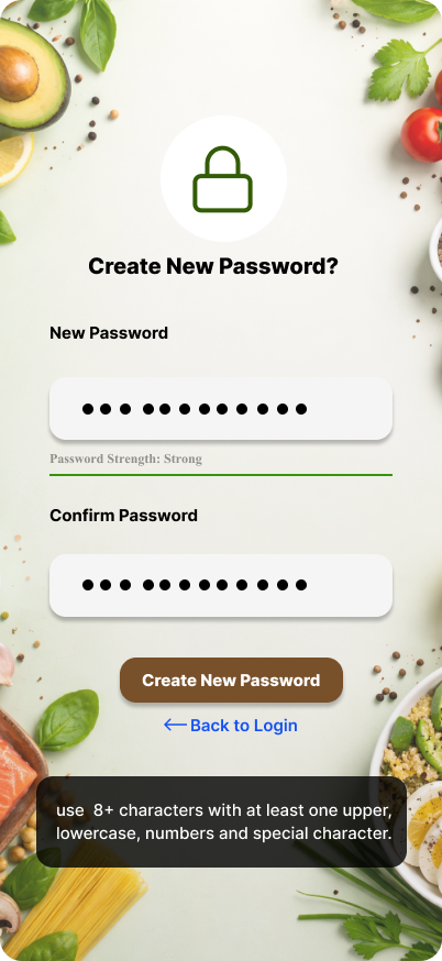
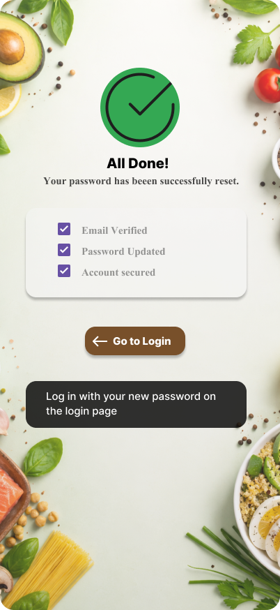
Sign In
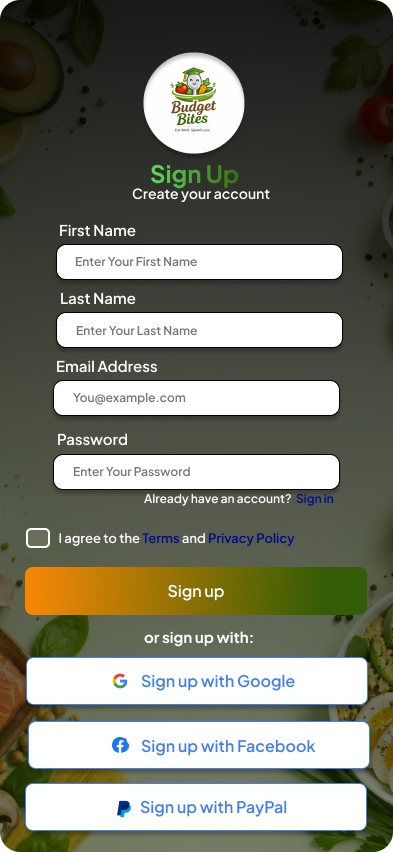
Sign Up
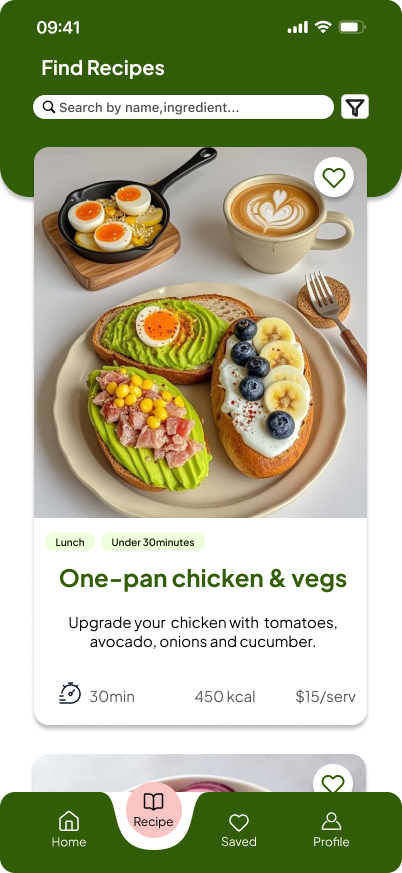
Recipe
Saved Recipe
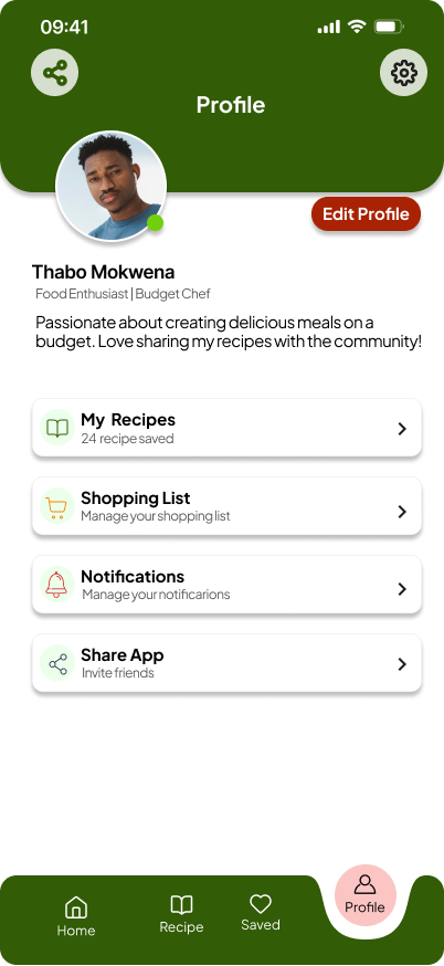
Profile
Built to Scale
Every element follows atomic design principles. One main component strategy, update once and it reflects across the entire app. Auto Layout ensures nothing breaks on resize.
Home Active

Recipe Active

Saved Active

What Was
Delivered
Hi fidelity screens covering all major user flows including authentication, discovery, recipe detail, and account management
Unified design system using one main component strategy ensuring full visual consistency with global style overrides throughout
WCAG AAA colour contrast compliance across all text and interactive elements for the highest level of visual accessibility