Zara.com
Redesigning the cart-to-checkout experience for first-time shoppers.
Researcher
The Starting Point
Zara is one of the world's most recognisable fashion brands known for its editorial aesthetic and high-fashion accessibility. Zara.com reflects that identity: cinematic imagery, minimal text, and a design language built for people who already know the brand.
First-time shoppers hit friction at almost every step of the purchase journey.
That same editorial design language creates significant friction for first-time and low-familiarity shoppers. The problem is concentrated at the cart-to-checkout transition.
This project is a targeted redesign focused on users who have never shopped on the platform. The goal is not to strip away Zara's identity it is to make the site legible for new visitors without compromising what makes it Zara.
The Core Friction
First-time and low-familiarity shoppers are getting blocked at the transition from cart to checkout because key actions and states are unclear 'Add' vs 'Add to Cart', missing size confirmation, and low visibility of the checkout button.
As a result, younger cohorts with limited prior purchase history struggle to complete core shopping tasks, increasing drop-off before checkout.
How might we make the cart-to-checkout path unmistakable, more accessible, and confidence-building by clarifying CTAs and item readiness so first-time shoppers can proceed to checkout without hesitation or getting lost?
How We Learned About the Problem
Four research methods were combined to ensure that every design decision was grounded in evidence, not assumption.
User Survey
34 respondents, 4 usability tasks. Quantitative and qualitative data on friction points across the full purchase flow.
Card Sorting
Participants grouped site features into mental buckets confirming that cart, size, and checkout should be tightly linked.
Competitive Analysis
Zara benchmarked against Shein, Mango, and Bershka across 9 UX performance dimensions.
SWOT Analysis
Mapped Zara's design strengths and weaknesses from survey data, then identified clear opportunity areas.
Around 95% of participants separated discovery, product decision-making, purchase actions, post-purchase management, and support into distinct mental buckets. Within this structure, participants also grouped Add to Cart across multiple sections suggesting they perceive it as a universal action that bridges browsing and checkout.
Together, these patterns validate an IA that reduces friction by keeping cart and checkout actions obvious, ensuring product pages contain decision-critical information like size selection, and enforcing consistent CTA labelling across every context especially for first-time shoppers. In short: users created clear, predictable buckets that match common e-commerce mental models.
Key Research Insights
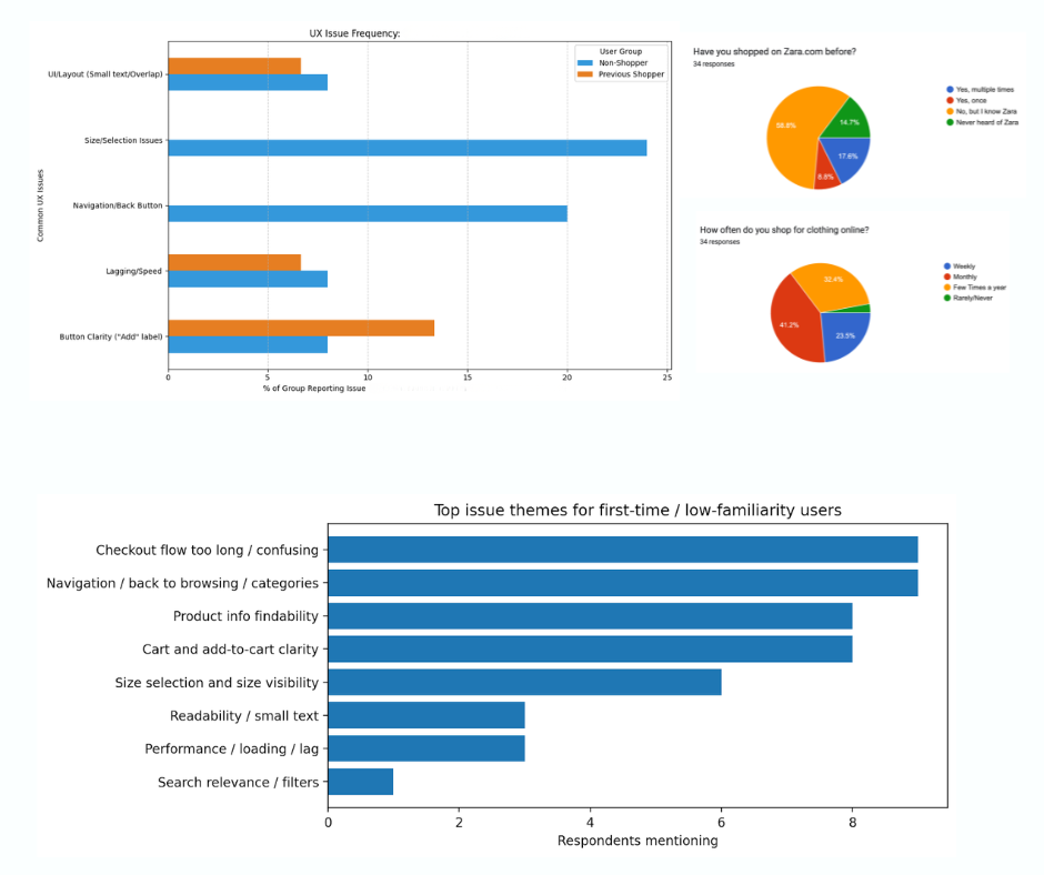
The survey reveals critical usability breakdowns that disproportionately affect users new to the platform even though overall satisfaction is reasonably positive.
 Research Dashboard Average usability scores, overall satisfaction, mobile vs desktop split, and friction frequency
The Four Recurring Themes
Checkout Friction
Checkout is the most commonly discussed pain area even among satisfied users signalling a structural problem, not an edge case.
Navigation Dead-Ends
Rated 3.68/5. Users rely on the browser back button and lose context after viewing a product. No breadcrumbs means no recovery path.
'Add' Label Confusion
Vague wording fails to communicate what action will happen. Direct respondent quote: "The label should be changed to Add to Cart for better clarity."
Desktop Readability
Text is too small on desktop, affecting the 26.5% of users on that platform. Small type compounds all other friction points.
 SWOT Analysis Strengths (Aesthetic Dominance, Performance, Info Availability), Weaknesses (Broken Sizing Logic, Navigation Dead-Ends, CTA Ambiguity), Opportunities, and Threats
Who We're Designing For
Two personas were developed from the survey data. The research pointed to a clear primary focus: first-time shoppers and users with limited purchase history showed the highest sensitivity to unclear CTAs and non-standard flows.
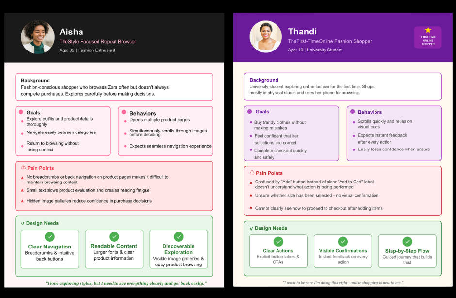
Where First-Time Shoppers Struggle Most
First-time shoppers who are not familiar with the Zara brand reported size and selection issues at dramatically higher rates than returning shoppers. The current UI actively under-serves this segment the exact group Zara needs to convert for growth.
 Non-shoppers vs Previous Shoppers size/selection issue frequency comparison
What the Competition Got Right
Zara was benchmarked against Shein, Mango, and Bershka across nine UX performance dimensions. A clear pattern emerges: every competitor requires size selection before cart. Zara does not.
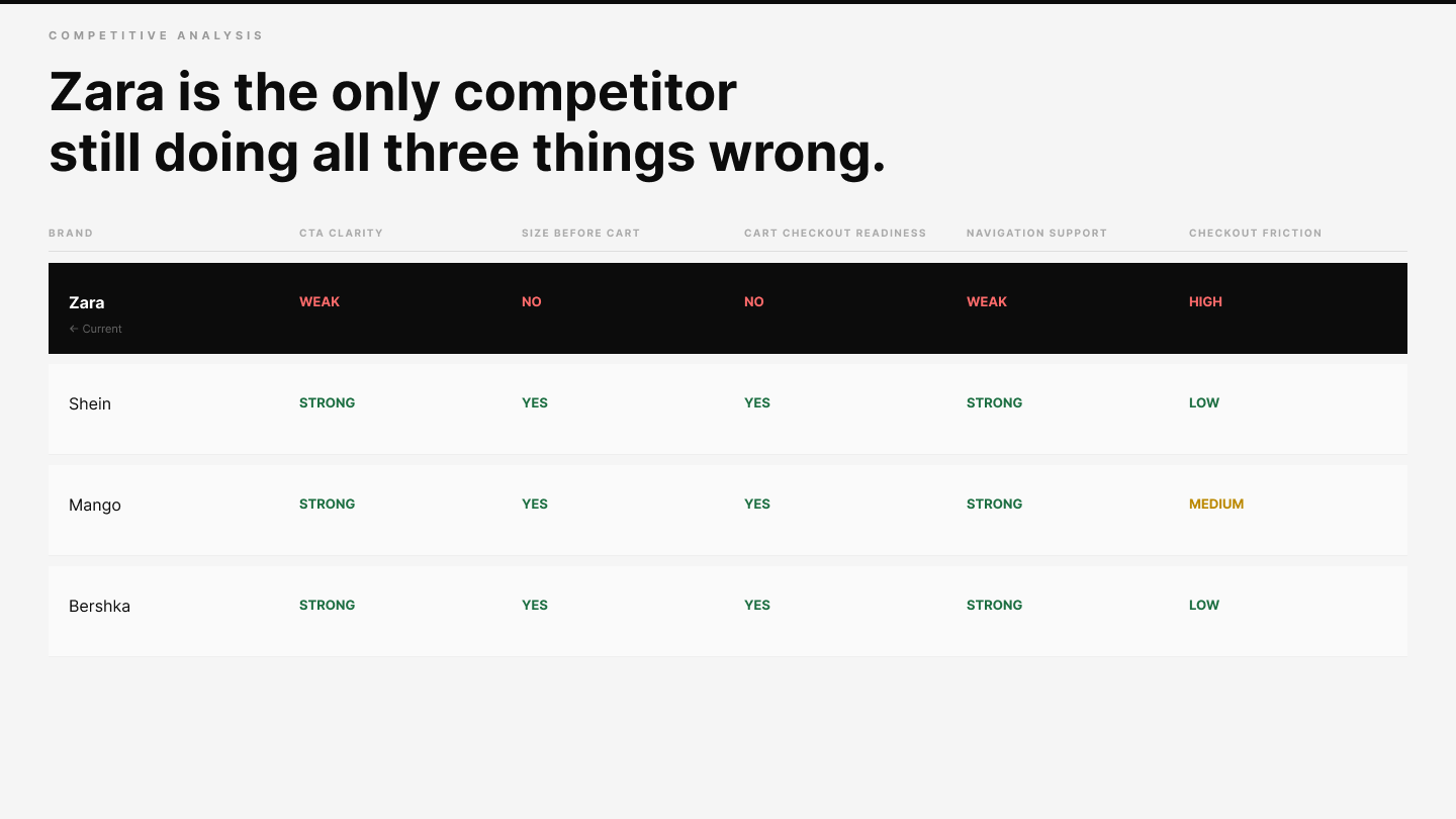 Competitive Analysis Zara (current) vs Shein vs Mango vs Bershka across CTA Clarity, Size Selection, Cart Readiness, Mini Cart Feedback, Navigation, and more
Every competitor requires size selection before cart. Zara does not. Users add items to the bag and only discover the size issue later when they are furthest from a purchase decision and most likely to abandon.
Feature Definition & Prioritisation
The MoSCoW method was applied to the pain points surfaced in research. Six features were non-negotiable Must-Haves. Everything else was a deliberate trade-off not an oversight.
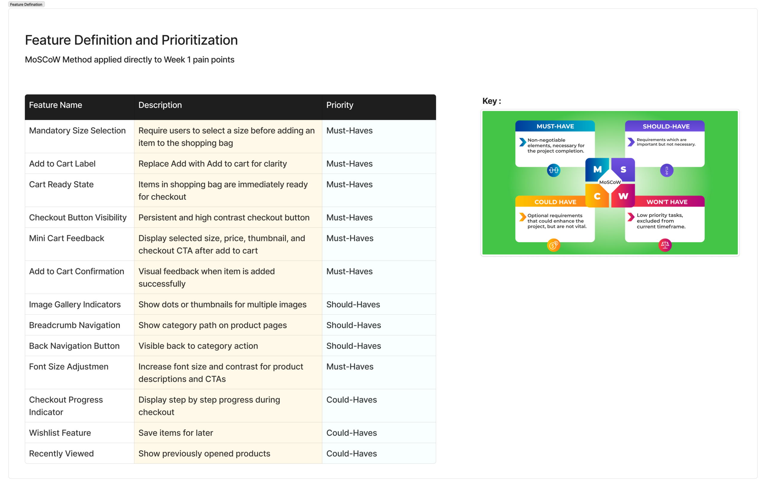 Feature Definition and Prioritisation 13 features across Must-Have, Should-Have, and Could-Have tiers
Mandatory Size Selection
Users must select a size before adding an item to the bag.
Add to Cart Label
Replace the vague 'Add' label with the standard 'Add to Cart'.
Cart Ready State
Items in the bag are immediately ready for checkout with no additional steps.
Checkout Button Visibility
Persistent, high-contrast checkout button always visible in the bag.
Mini Cart Feedback
Show thumbnail, selected size, price, and checkout CTA after adding an item.
Add to Cart Confirmation
Clear visual feedback when an item is successfully added to the bag.
Sitemap
The sitemap defines the full navigational structure of the redesigned Zara.com. Key principle: reduce navigational dead-ends. Breadcrumb trails and clear back navigation were built into the structure from the start directly addressing the 3.68/5 navigation score.
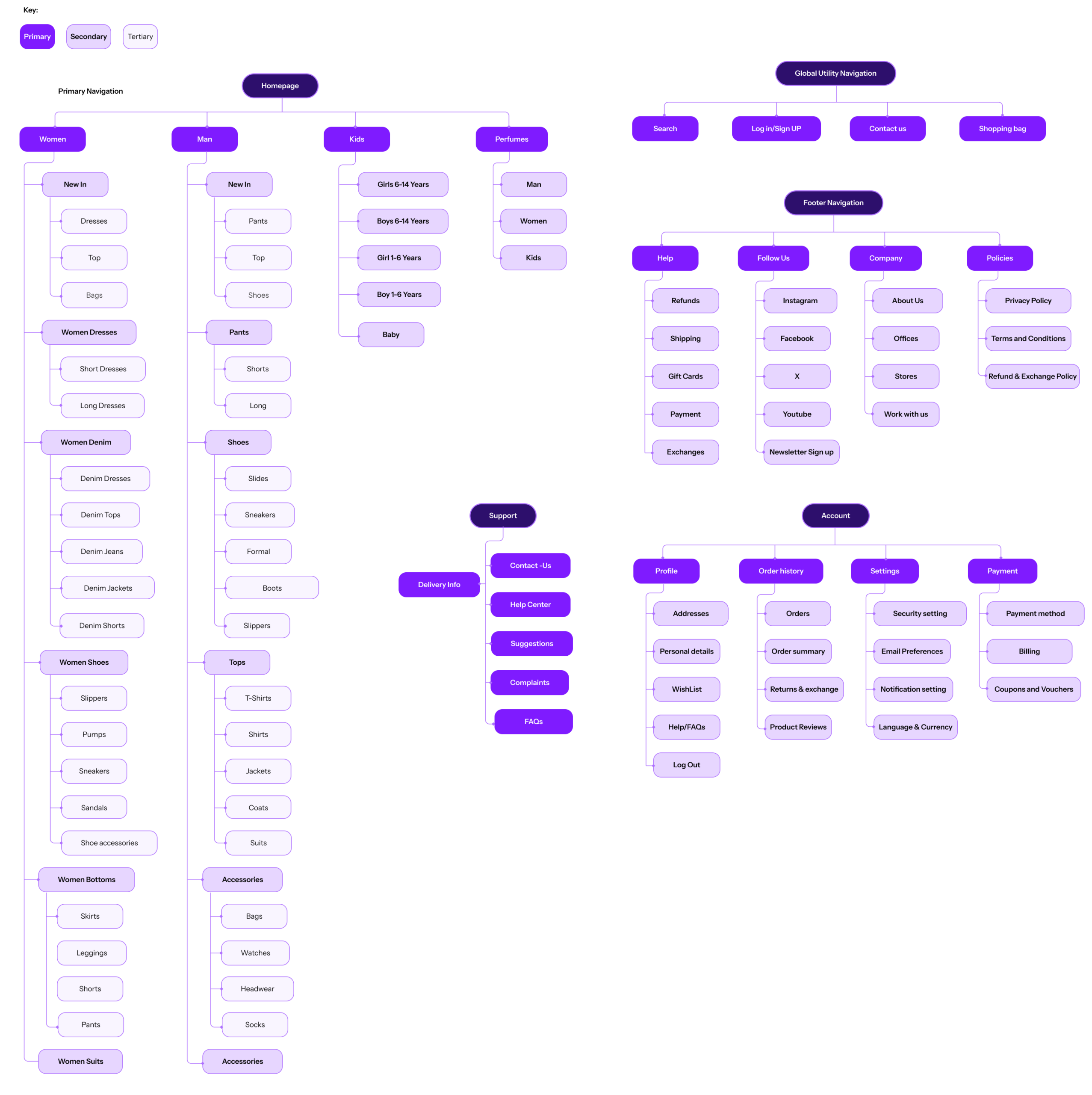 Sitemap Primary Navigation, Global Utility, Support, Account, Delivery Info, and Footer all three levels
How Users Move Through the Site
Four user flows map the core journeys. Each addresses a specific failure mode identified in research not abstract scenarios, but real paths where users were observed struggling.
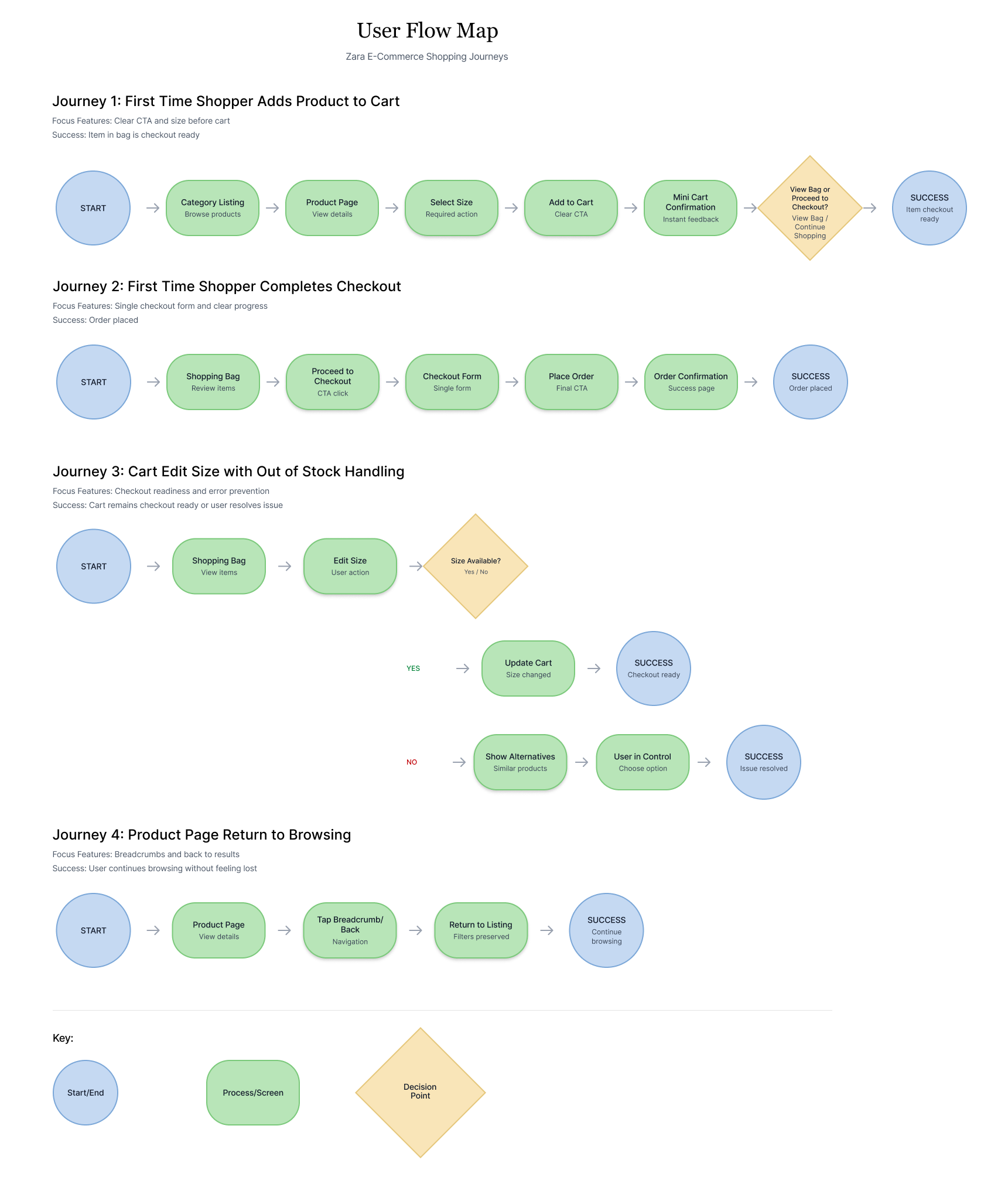 User Flow Map all four journeys with decision points and error states
Moodboard & Style Tile
Before a single component was designed, the visual tone was established. The direction chosen was Classic Editorial deliberately preserving Zara's premium, magazine-like aesthetic rather than sanitising it into a standard e-commerce look.
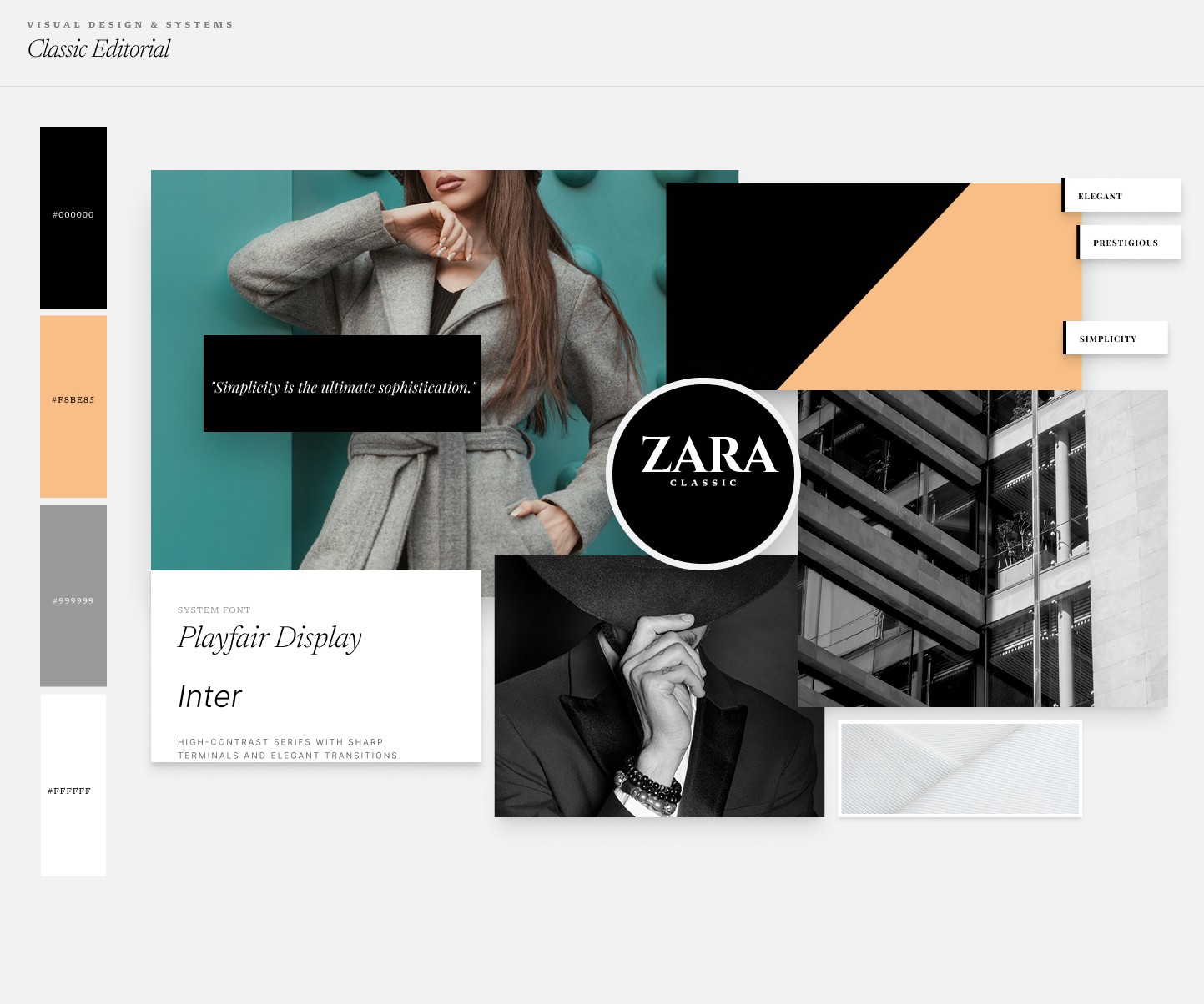
Style Tile
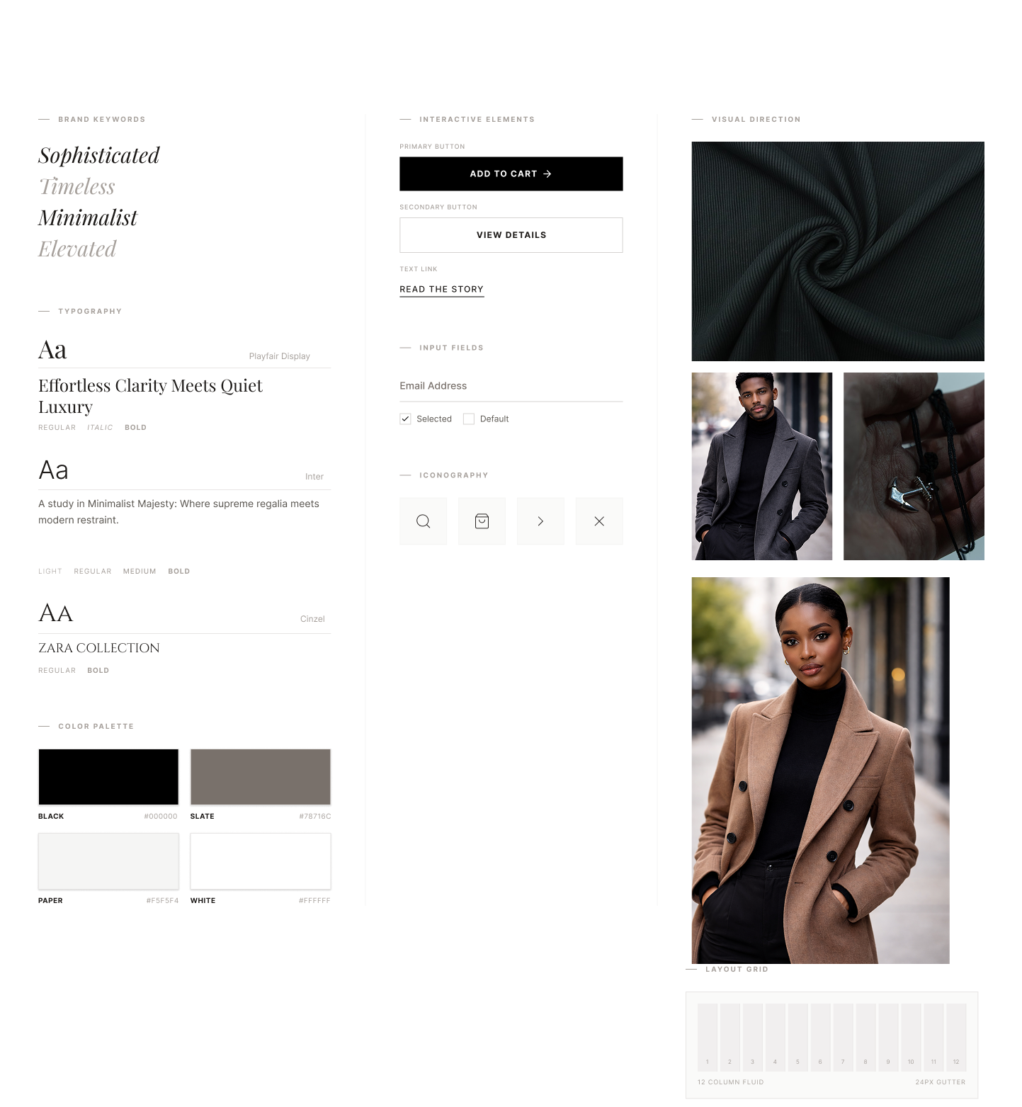
Visual Foundations
The design system documents the core visual elements typography hierarchy, colour palette, layout system, and component library. One main component: update once, it reflects everywhere.
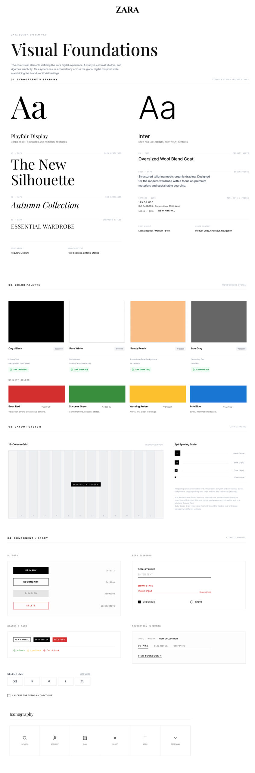 Visual Foundations Typography, Colour (all WCAG AAA), 12-column grid, Component Library
From Structure to Screen
Wireframes were developed after the user flows were finalised ensuring every screen decision was anchored to a documented user journey. Ideation began with hand-drawn sketches before moving to Figma.
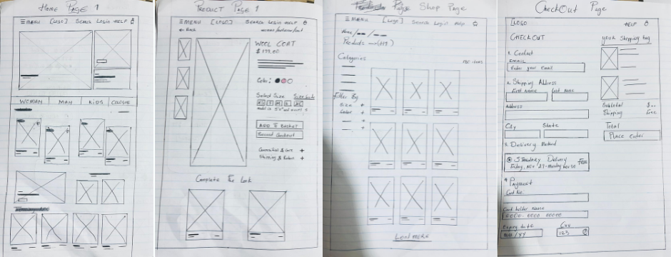 Early ideation sketches exploring structure and hierarchy before digital wireframing
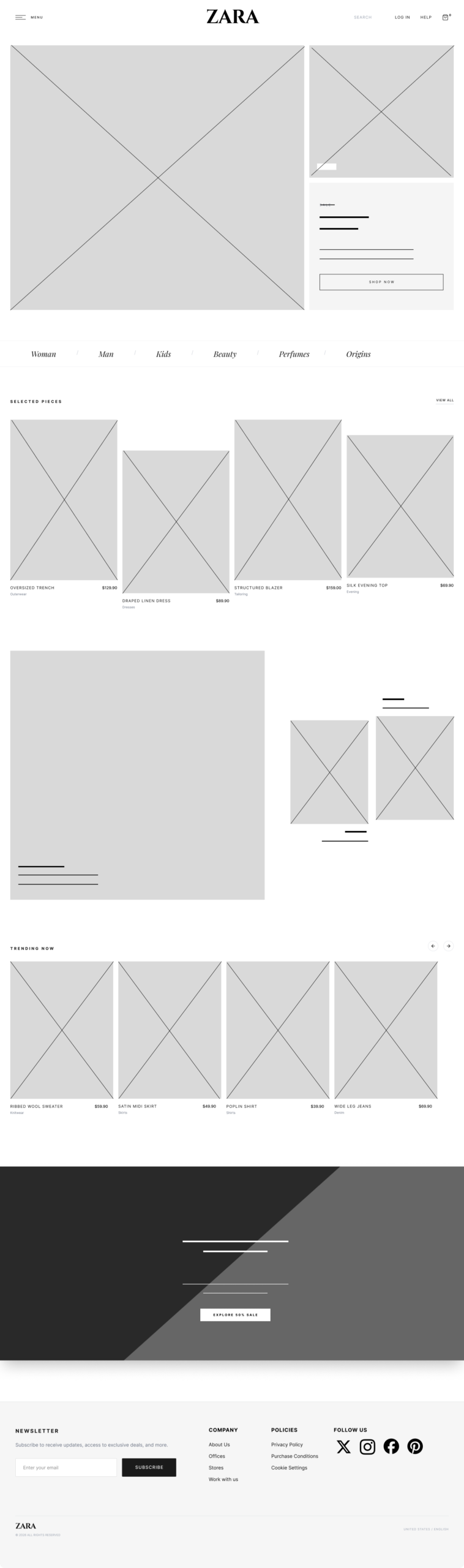 Hero section + 4-column product grid two-section structure with annotations
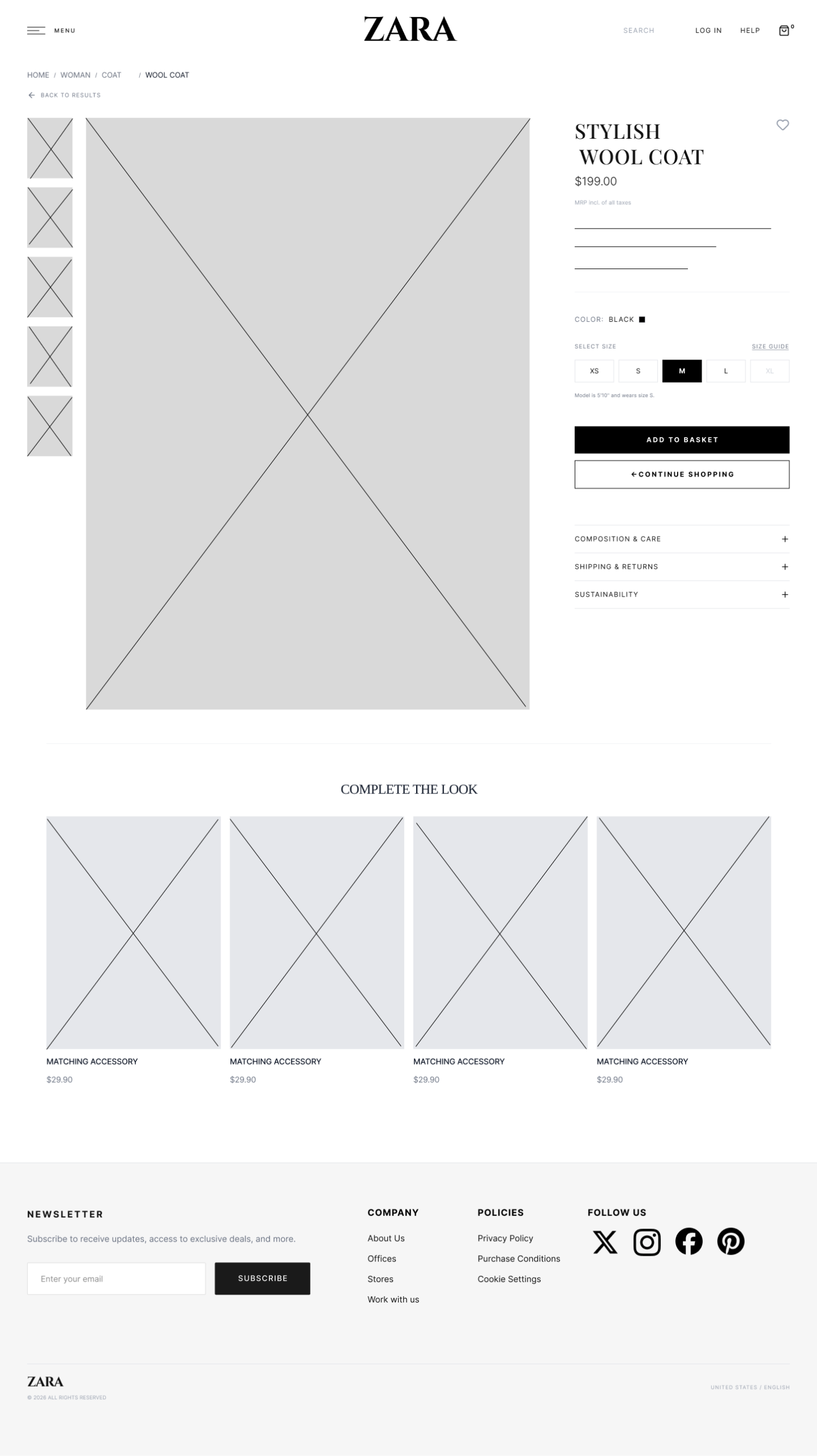 Mandatory size selector prominent, correct 'Add to Cart' label, breadcrumb navigation
Four Decisions That Defined the Redesign
Each decision emerged from a specific, evidence-backed finding. Each was tested against at least one alternative before being chosen.
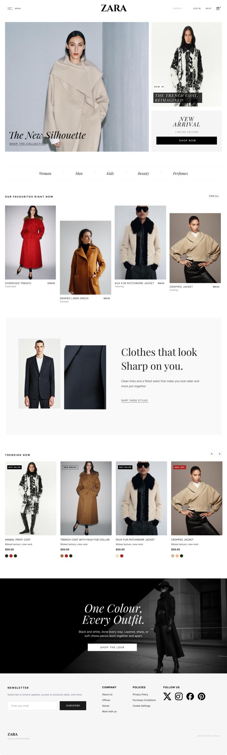
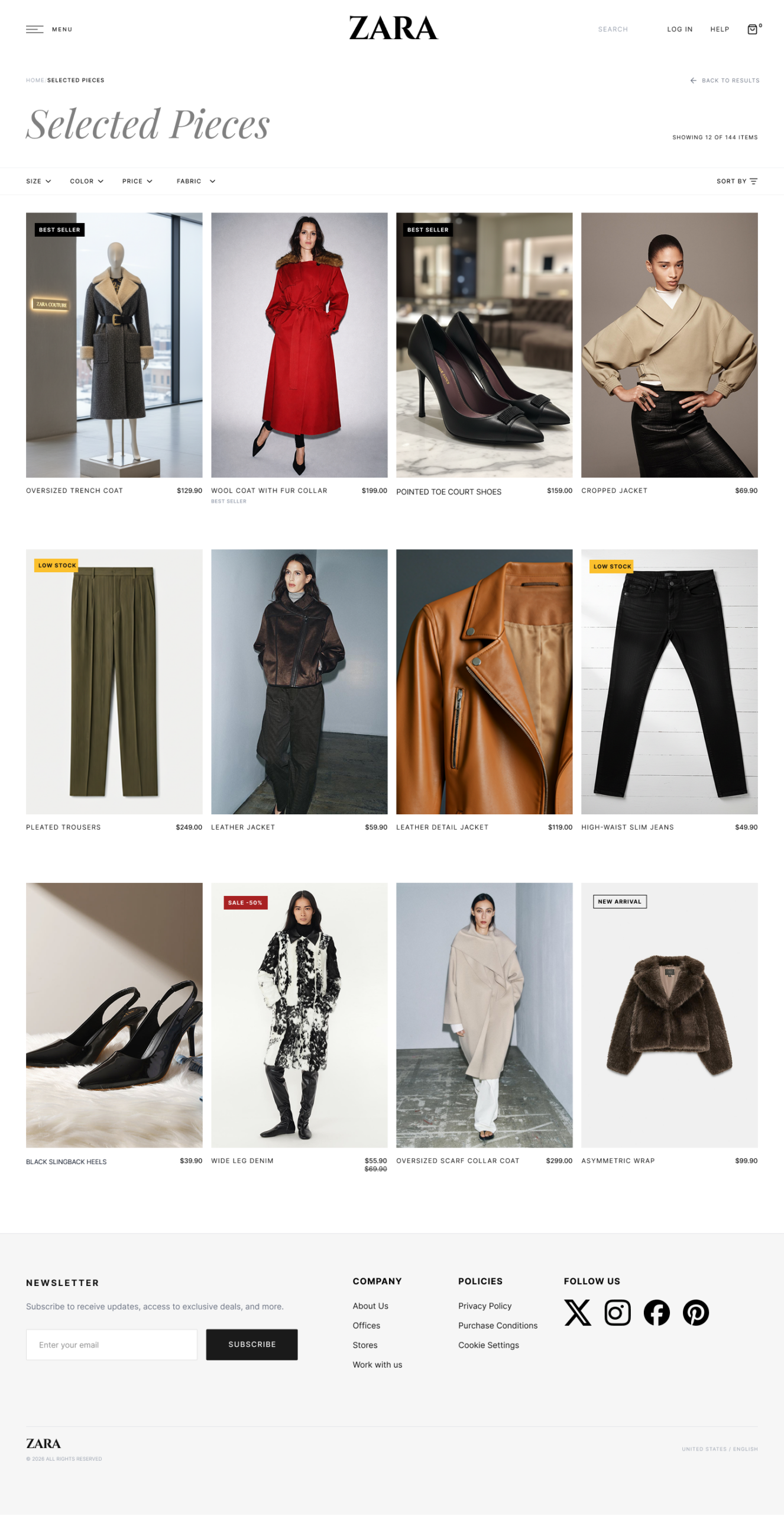
The Home Page: Editorial Identity vs E-commerce Legibility
| Problem | Zara's full-bleed editorial hero communicates brand but fails to signal 'this is a store you can buy from' to first-time visitors. Current bounce rate: 29.15%. |
| Options | (A) Keep editorial hero only preserve brand. (B) Replace with product grid standard e-commerce but loses identity. (C) Keep hero and add 4-column product grid below. |
| Chosen | Option C Editorial hero preserved. 4-column product grid added below the fold. |
| Rationale | The grid uses the same pattern as WooCommerce, Shopify, H&M, and Takealot standard enough to signal 'shop here' immediately, while the hero remains unmistakably Zara. |

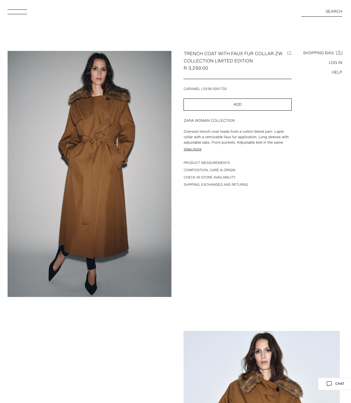
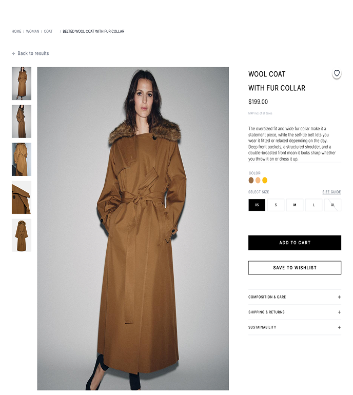
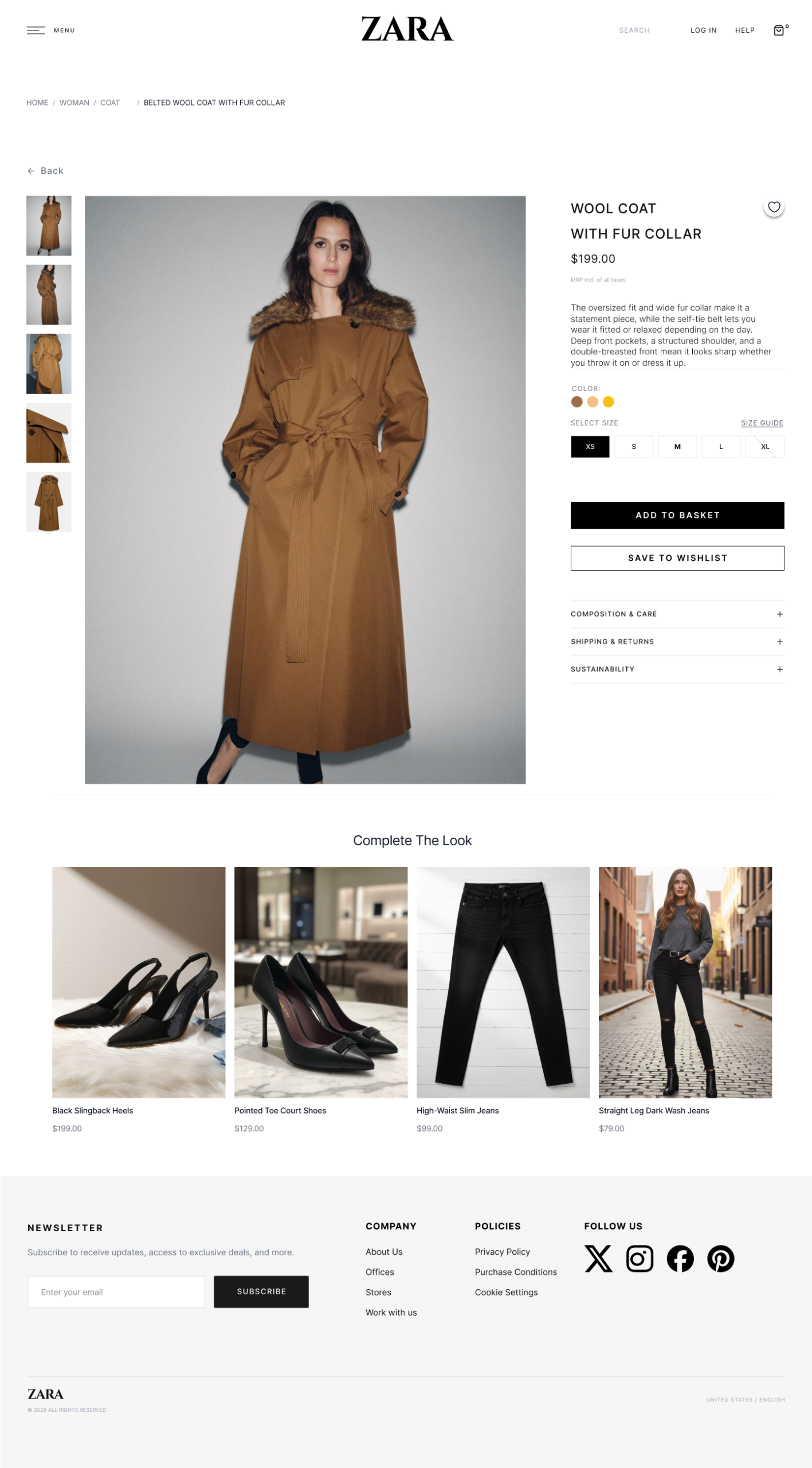
Mandatory Size Selection Before Cart
| Problem | Users add items to the bag without selecting a size, then encounter the size selector inside the bag furthest from the purchase decision. 'Broken sizing logic' was the single most-cited frustration. |
| Options | (A) Keep current flow size selection inside the bag. (B) Make size selection mandatory on the product page before Add to Cart becomes available. |
| Chosen | Option B Mandatory size selection on the Product Page. |
| Rationale | Every competitor (Shein, Mango, Bershka) requires size selection before cart. Standard mental model: choose product, choose size, add to cart. Deviating has a measurable abandonment cost especially for first-time users. |
CTA Label: 'ADD' → 'Add to Cart'
| Problem | The 'ADD' label does not communicate what action will be performed. Users were unsure if they were adding to a cart, a wishlist, or saved items. One respondent wrote directly: "The label should be changed to Add to Cart for better clarity." |
| Options | (A) Keep 'ADD'. (B) Change to 'Add to Cart' standard e-commerce label. (C) Change to 'Add to Bag' uses Zara's internal language. |
| Chosen | Option B 'Add to Cart' label. In testing, 3 of 5 participants paused before clicking. After the label change: 0 hesitations recorded. |
| Rationale | The word 'Cart' activates a deeply familiar e-commerce mental model that 'Bag' does not carry for first-time users. |
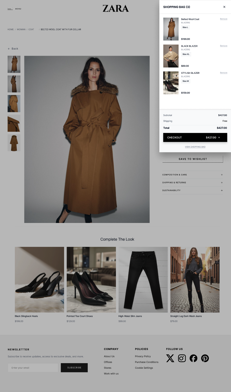
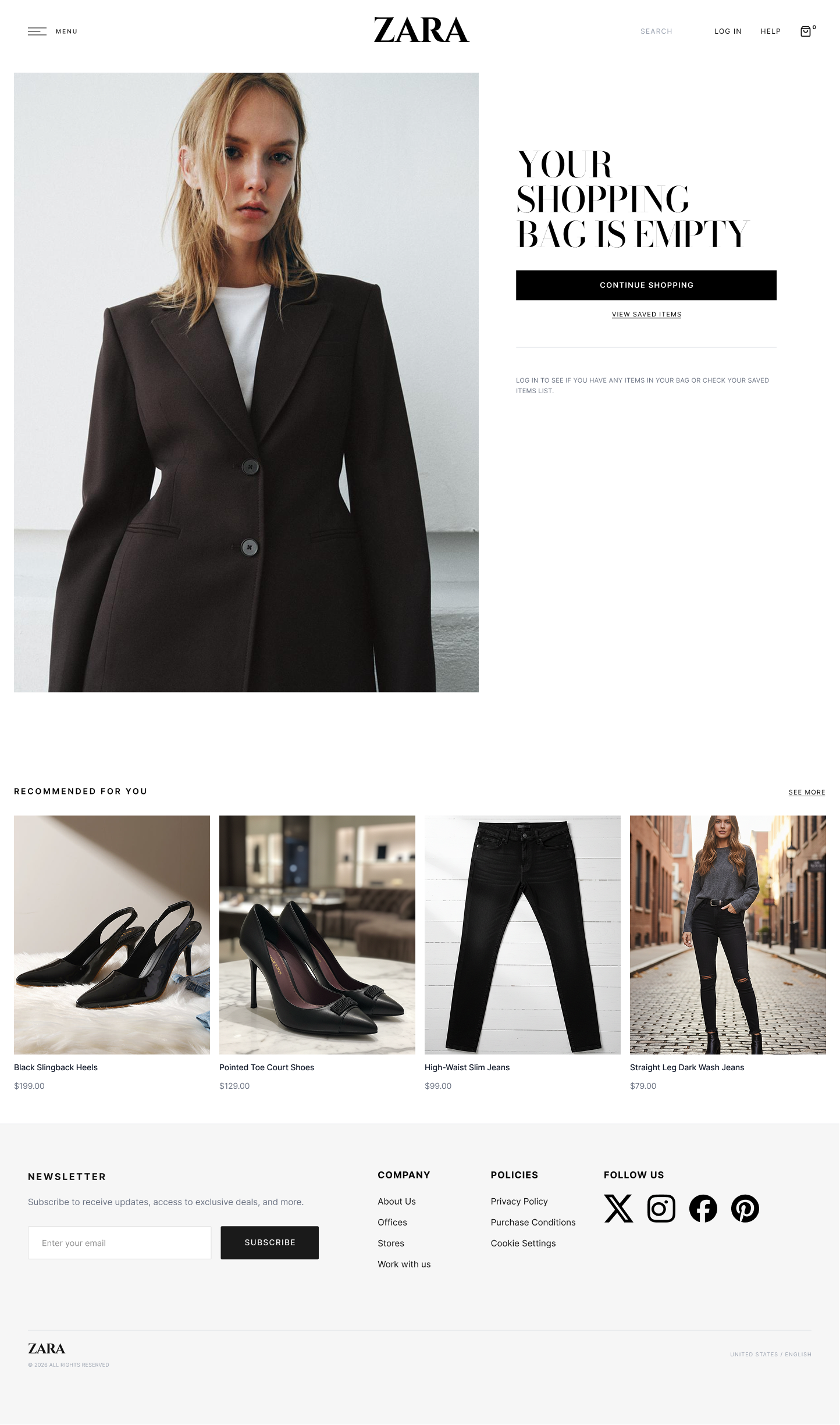
Mini Cart Confirmation After Adding an Item
| Problem | After adding an item, Zara.com gives minimal feedback users are left uncertain whether the item was added. The bag icon count updates but there is no explicit confirmation or next-step prompt. |
| Options | (A) Keep current icon update only. (B) Redirect to full bag page. (C) Mini cart overlay showing thumbnail, selected size, price, and checkout CTA. |
| Chosen | Option C Mini cart overlay with full confirmation. |
| Rationale | Instant feedback is critical for first-time user confidence. The overlay shows item image, name, selected size, price, and a high-contrast 'Proceed to Checkout' CTA. Users can continue shopping or proceed directly eliminating the uncertainty that drives abandonment. |
High-Fidelity Screens
The high-fidelity prototype covers the complete purchase journey from Home Page to Order Confirmation across eight screens. The prototype is interactive and clickable in Figma.
Home Page
 Shop Page
 Product Page
 Shopping Cart
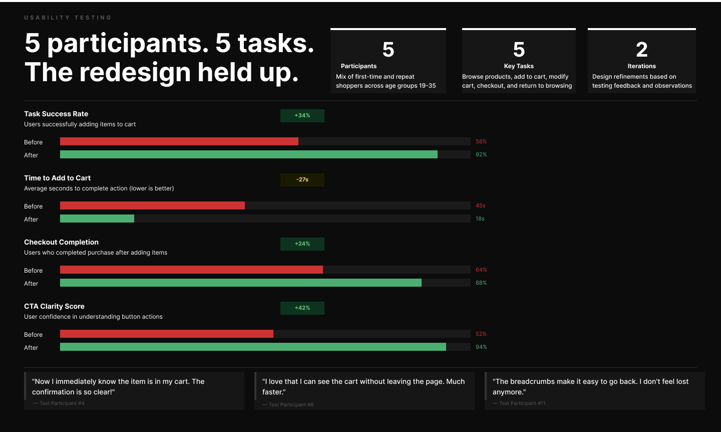
Validating the Design
Usability testing was conducted with participants completing one core task: add a product to cart and proceed to checkout. Participants were observed without assistance the goal was to identify hesitation, confusion, and failure points in the natural flow.
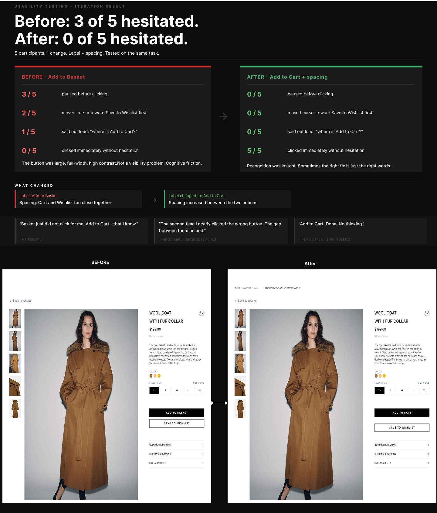 Usability testing results before and after comparison across four key metrics
"Where is Add to Cart?"Participant 2 · Task 1: Add a coat to cart and proceed to checkout said out loud while looking directly at the 'Add to Basket' button. This confirmed the label change was not cosmetic. It was a conversion-critical fix.
What Was Delivered
Designing for first-time users surfaces problems that familiarity hides.
Returning users develop workarounds. New users have no such buffer. Designing for the unfamiliar eye improves the experience for everyone.
Small language changes have measurable conversion impact.
Changing one label from 'ADD' to 'Add to Cart' eliminated hesitation in 100% of post-change test participants. Copy is UX.
Editorial identity and e-commerce clarity are not in conflict.
The 4-column grid and the cinematic hero coexist. The redesign catches visitors before they leave without diluting what makes the brand.
The research triangulation model worked.
The same issues appeared independently in the Week 1 survey and in Week 6 usability testing confirming real findings, not research artefacts.